


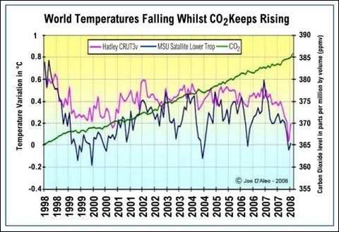
I attach the temperature graph for the last 10 years. There are two sets: the Hadley Centre's surface temperatures plotted in magenta (tending to be over-estimates and less reliable) and the MSU satellite temperature readings in blue. There is no correlation at all with the rising CO2, shown in green.

 Reply With Quote
